From Adonis to Zambinella and Back Again
“From Adonis to Zambinella and Back Again” like the phrase it mimics, represents anything and everything, we, as “beneficiaries” of this so-called bounty, get to choose from in this so-called life. The pursuit of Happiness indelibly imprinted in our minds and in our hearts is like a prism of choices broadcast to light, forever presenting us with things to buy, moments to purchase, and memories to collect. We are hungry for profit, land, and space. We know no other way. We must refresh life as much as we do our browsers.
More than anything in this world, we rely on letterforms: blown up, large, intrusive, attention-grabbing public displays of aggression. They are our most basic visual forms of communication. They are our “choices broadcast to light.” Letterforms are so engrained in our minds and so engraved in our eyes, we often don’t even regard them as visual. The letterform’s trickery lies is in its camouflaging as landscape, in its banality as spectacle, and in its role as director.
We are taught to treat the aesthetics of letterforms as though they are transparent — straight to the meaning without question of origin or development — but I can’t help but pay closer and closer attention to the construction of forms in language when I read, when I speak, and when I imagine. To think of letterforms as visual counterparts to their signified meanings often seems “beyond the point,” but it is exactly the point. From mass media to tech media, everyday is a battle with words; they are objects to contend with just as much as they are a means to communicate with. Language is a medium from which both subject and object derive. It is the monolithic block of marble from which Michelangelo chiseled out his unfinished Atlas Slave; it is the marble block, the figure within the block, and the artist who finds the figure all acting together that creates the invisible shape of language. To use language to the best of its utility is to find the nature of its grain.
Writing, like the evolution of the salamander, started wet before it became dry. Abstract impressions of early life served as accents to the larger, more prevalent oral tradition before they matured into explicit meanings. Much more of an interpretive art form in its infancy, written language first equated to picture drawing and the visualization of the spoken word; Designations of meanings and sounds had yet to be established and the drifting signifiers of language were freer to roam. A letterform functioned closer to that of an open source website in its nascent days before it was tinkered down to a single connotation.
Subconsciously subsumed during the act of reading, the graphics of language has always played second fiddle to its syntactically bespoken partner. “From Adonis to Zambinella and Back Again” as logo compilation is an examination and reclamation of how we see, read and recognize simultaneous distraction throughout our soon-to-be seamless world of virtual capital. A remix of typographic elements commonly and collectively known to belong to some of the most prevalent industries and corporations over the last fifty years, the “logo” comes out fussy, not linked to one particular reading, unsure itself as to what it is spelling. Is it “amazing” or “amyszoing?” “Amys/zong” or “Ah-Meh-ZeeN,” the ‘G’ completely dropped like a forgotten member of a “Mean Girls” clique? What if a word could sound itself out?
Letterforms are “readymades” prepped for sculpture. When companies get so well known the initials of their logos redeem the same potency as that of their proper names, these “readymades” become semantic shortcuts to the brand’s culture at heart. They demonstrate the type of “so-called bounty” advertised to the consumer; the plentiful amounts of merchandisable glory purchasable with a finger tap.
We have entered a new era of Pop Internetism. The letterforms of “amys/z(o)(i)nG” form a social gathering of proud foots playing themselves out as though at a Social Ball for the Bold, the Beautiful, and the Internet. Lined up like the usual prophets at the Last Supper, each letterform stares the other down sideways. The A is assuredly for Amazon, but it’s brown like UPS and its inner almond points down, instead of up. It is surreptitiously haloed next to a bygone era of golden arches discolored but doubled for pleasure. The Y of Disney’s plays vowel or consonant depending on how it wants to hedge its bets, and the S is for Sears, dead on recognition, like its business, but indelibly imprinted into the fabric of American consumerism. The Z completes “From A to Z” of Amazon, replete with a diseased Predator-faced smile mimicking the arrowed smile of the logo. Now sometimes utilized as the whole of Amazon’s logo, the Amazon smile is the “have a nice day” Smiley Face for the Digital Age.
The I and the O of Disney (because we can never get enough Disney) toggle like the integers of the digital binary code they wryly resemble. Allowing the reader the option to include the I, the O, or both, “amys/z(o)(i)nG” skews closer to something of a play with meaning than a telling of one. This kind of ambiguity of intention, tone, and connotation locates “amys/z(o)(i)nG” apart from the camps of graphic design and signage, and gleans it closer to those of painting and sculpture. The viewer’s participation creates an indirect relationship with meaning that subverts their assumed relationship, creating a fan of possibilities to go down, rather than a specified one. Letterforms play like characters coming on and off stage, and at the helm, Google captains this ship of fools steered toward the oculus of pain. To its adjacent, a spray-painted emblem of primary colors blurts abstract signifiers come from traces of thought, like perception’s first summit; without words, but not without mind. Like a handwritten signature at the end of a typewritten note, it signs off with a flourish of personhood.
A single punctuation mark leans central amidst the inflected-word-piece-painting-sculpture. Between the S and the Z a slash plants oblique like a javelin thrown into its word of play. It slants as if a mirror propped for reflection or an easel ready for painting. Combined with the S to its left, and the Z to its right, the slash quotes the source material from which “amys/z(o)(i)nG” takes many cues.
An essay published in 1970 by the critic Roland Barthes, “S/Z” circles around a short story written two centuries earlier by a fellow countryman of a storyteller, Honoré De Balzac. A kind of critique rare to visit the fictional world, Barthes deconstructs the tale of “Sarrasine,” one of the many fables chronicled in Balzac’s anthology of Parisian life, The Human Comedy.
At times it feel as though Barthes has a vendetta to take out on Balzac, and at no point in his essay does Barthes admit giving a post-structuralist reading to neoclassical rom-com is a bit of a fool’s errand. Nonetheless, a fool’s errand is often an intellectual’s job. What Barthes accomplishes in the end brings the reader closer to the codes and underlying messages behind what may seem like innocent description or general fodder, but is in fact very intentioned writing on Balzac’s part: to affect or sway the plot, the reader, and its characters. It is with Barthes’ fine toothcomb that he brushes back the long subconscious eyelashes that block the reader’s view.
Language has a thousand faces, but most often it’s thought only to have one. “amys/z(o)(i)nG” explores the visible pluralities of meaning within a word-graphic. Akin to the aims of Barthes, “What we seek is to sketch the stereographic space of writing,” where words and books and essays can be made sculptural, the way a set of 3D glasses makes a flattened plane of vision sculptural. In creating physically manifested letter shapes routed out of plastic, I felt I could liken language closer to its sculptural effects. To see and feel words as objects and subjects creates an intimacy with language lacking in society’s relationship to it. The public space of words has gone viral while our sense of touch has gone static. Reading used to be the primary activity we performed alone in public, but now surfing the Internet is. Making the letters of “amys/z(o)(i)nG” sculptural, allows for the imaginary to partake in the glyphs of yesteryear while holding the letters of today.
The medley aesthetic of independent agents of power, community, and happiness exemplifies the vast virtual network within the competitive marketplace this word recreates. In treating each letter to its own autonomous space, the viewer is given the opportunity to circumnavigate the surreal landscape of language. The spelled out social distinctions of each letterform carries with them great influence in the ways words are read. They can put in or take out the picture that was the word before it was the word and they can disguise meaning with many clever types.
Disguised meaning takes its principle form in the story of “Sarrasine.” What is the case graphically is what comes to pass narratively. On a linguistic level, the syntactical collision of “S/Z” is a “meet cute” of storybook love. The two lose their difference to create a shared sound. While seemingly suspended in an ambiguous field of love and hate, they stare back at each other, locked like a picture. They copy each other as Lucy and Harpo once did, reciprocating each other’s movements, fooling with each other’s properties, or even more, fooling with each other’s ideas of each other’s properties. Before long, S and Z start to confuse each other’s roles and find themselves enmeshed in a messy affair they can’t see their way out of.
“Sarrasine” dispels the memoir of a young Parisian sculptor who finds himself trapped in the binds of love and hate. Like Peter Seller’s character in “Being There,” Sarrasine was a boy who grew up hidden from the outside world before entering it. Having tended to his garden, or in Sarrasine’s case, his sculpture, until the overripe age of twenty-two, Sarrasine is finally released from the reins of his master Bouchardon, to embark on a journey to Italy, “the birthplace of the Arts.” While there, he falls madly in love with an Opera star, the Prima Donna; a man he assumes is a woman. Besot with obsession and completely unaware of the Roman Theater and its customs in the year 1758, he compulsively attends every production, reserving a balcony all to himself to gaze and admire his one true love.
Sarrasine begins work on a sculpture made in the Prima Donna’s image and soon falls doubly in love with the figure and the opera star we learn is named La Zambinella. Similarities run deep between the shores of Sarrasine and his Greek mimetic friend, Pygmalion, as Sarrasine admires his sculpture of La Zambinella to the degree Pygmalion loved his sculpture of Galatea; shortly thereafter, Sarrasine finds he can love no one else but Zambinella, just as Pygmalion found he could love no other but Galatea.
The story rounds its final bend when Sarrasine ultimately learns his sculpture of Zambinella is impossibility realized, for his beloved Zambinella is not a woman, but a man. Gob-struck by this news of Zambinella’s original order, Sarrasine abducts the singer and takes him to his studio. He roughs him up and tags him a god-forsaken liar! In a scene not too dissimilar from something out of “Swimming With Sharks,” “Sarrasine paced up and down the room” while “half dead, the singer remained in the chair.” Sarrasine laments his future divestments due to this uncanny likeness of body. He complains, as he recoils back to his role as Pygmalion, that he “shall forever think of this imaginary woman [the sculpture] when I see a real woman… For me, you have wiped women from the earth.”
Zambinella is a castrato, the darling of the Teatro Argentina in Rome and the Papal States during a period of time when castratos were most admired. He is a diva of the shiniest kind, treated like Beyoncé would have been treated. Sarrasine, a naïve youth not savvy with the ways of Italy has been “castrated” by these truths, and stripped of pride and circumstance. Driven mad, Sarrasine tries to kill Zambinella in pathetic desperation, but is stabbed thrice by three of the Cardinal’s guards before doing so. The castrato is saved. His sacred space of odd existence left in tact.
The introduction of the castrated class and the ambiguity that comes with it, as signs no longer reading straight forward have signs reading “signs no longer read straight forward,” brings to fore an alternative axis of comparison that leans away from a conventional system of relations based on a binary definition of gender. The traditional male-female dynamic has been tipped over, and a new order has been introduced: the “castrating,” stronger, active, alpha types, and the “castrated,” weaker, passive, beta types. No longer is order or power received along a biological axis, but along a symbolic one of “castration.”
The life of the castrato is the mystery of “Sarrasine.” Zambinella being the literally castrated; straddles the line between the two camps, exhibiting his facility to play both parts. He also plays the line and the space between the two, for he is like a third eye, with scope and perception only the supernatural possess. He is a figure of fascination, out of this world, and like his fellow outcast, the fool, he is a mythical creature said to host many of the world’s secrets.
Zambinella as prima donna diva admired for all the wrong reasons under circumstances of beauty and love, becomes the model incumbent for a line of paintings that passes through the storyline of Sarrasine. The sculpture of Sarrasine’s based on Zambinella was used as a model for a portrait painted of Adonis, the eternally youthful male icon of beauty and desire. This painting of Adonis was then used as the model for another male beauty of Greek mythology, Endymion, depicted in Girodet’s real life painting “The Sleep of Endymion,” completed in the year 1791, now hanging in the Louvre.
In it, Endymion lays bare amidst nature, like a male Odalisque, a sleeping beauty. A beam of light bathes him in moonshine as if he were Marlene Dietrich haloed by Fresnel lights. His limbs soften and his pallor whitens under the Moon’s gaze. Applying a kind of reverse -“sfumato,” the technique Da Vinci became so well known for, where he “smoked out” features to blend in and out of sight, Girodet does the same (or is it the opposite) but with light, “beaming out” detail, so that all that is left is smoothed out vanity. Set beneath the boughs of a bucolic landscape, Endymion rests like a lady in waiting, as if Girodet knew the mask behind the model was female.
And so it was written. Once upon a time, S mistook Z for a she, and “From A to Z and Back Again” became “But A is Z and Back Again.” Adonis is Zambinella, and Zambinella is Adonis, and Endymion. The Opera star as model for generations of art forms sings according to the Ball of Circumstance they are invited to.
Gender can feel like an implanted apparatus operating inside your body; Language can feel like an implanted apparatus operating inside your head. Thoughts can be wrung dry of signification when used cleverly, and those ideas you thought were yours, might strike you as someone else’s repeating something you heard you’re not sure when. Glyphs surmised to form a letter to form a word to form an idea to form some locomotion of life forming before your eyes, and you wonder how you’d ever leant to think with these words in the way that you do, and what if you could learn it all again, in a different way, on another path, in someone else’s head, in someone else’s body.
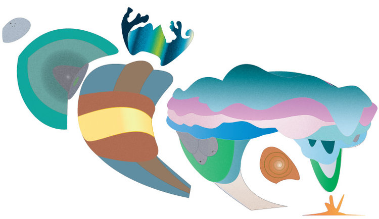
Like the journey of an egg’s contour, to follow its edge from bottom to top, and back to bottom, would mimic the contour of “From Adonis to Zambinella and Back Again.” Similarly, but of polarizing difference, like the journey of an egg’s embryo, to follow its development and growth from start to finish and back again, would mimic the journey horizon that is “Adonis is Zambinella and Back Again.”
Where Graphic Design’s place is usually thought to be under the pretense of commerce or consignment, Art’s, is usually thought to be under that of concept or critique, and where graphic design is usually known for its precision of line and clarity of message, Art is usually known for its “painterly” blurring of line and disparity of message. Graphic Design, it turns out, is very much like Sarrasine, and, Art, like Zambinella. One the more straightforward, non-subversive type of messenger (Graphic Design, Sarrasine), the symbolically complicit “castrated” demonstrator of aesthetic commerce, and the other, the more ambiguous, elusive, oftentimes critically subversive type of signified codifier (Art, Zambinella), who draped in draped in history and meaning, represents the symbolically “castrating” demonstrator of the history of culture, who like the castrato, possesses the versatility to tap into both of the axis, must endure the highs and lows of life as an outcast.
“amys/z(o)(i)nG” is a typographic-pictorial work birthed from the seeds of graphic design, sculpture and painting. Conceived as a logo for art’s sake, the logo-artwork retains the character of its influences while becoming it’s own landscape of signs. Letters act like visual liaisons dressed in still life, and forms and colors bend and blend like rolling hills caught in the glare of the sun. Interpretation can range wide and run deep, as wide as a population and as deep as a person. “From Adonis to Zambinella and Back Again” shows both sides of the river and the language that runs through it.